Understanding the Design Process
We are exposed to hundreds of logos daily, and yet some seem to stand out more than others; McDonald’s golden arches are just as recognizable as Target’s red and white bullseye, Coca-Cola’s red silky ribbon font, or Nike’s swish. You probably wouldn’t recognize their original designs if you saw them. That is why having a refreshed and professional icon is important for any growing company. Last week we discussed the importance of hiring a designer for the redesign process. You likely found that you still had more questions, so this week we will discuss the creative process of design.
What a Logo Should do
A logo should make a strong first impression that is immediately recognizable and memorable. If you were to personify the company’s brand and give it emotions, thoughts, and a personality, what kind of person would it be? Consider the logo as the business’s face as well as their signature. It is essential to encompass as much of the company’s personality into this small icon so that potential customers can understand who the organization is and what it provides instantly. Remember that this icon also acts as a signature for your business, so everything it signs off on reflects back.
A good logo should suit the company’s personality and stand out to differentiate itself from the competition. Distinctive designs set you apart from others and provide a distinguished sense. The goal is for an icon that is timeless; appropriate for your business; and inspires a feeling of trust, admiration, and superiority. Some even incorporate a sense of humor with a double meaning, such as Amazon’s logo comprising of an arrow that displays the following three images: (1) the idea of shipping and going from point a to point b, (2) the idea that you can purchase “A à Z” there, and (3) the grinning face of someone who saved time and money while shopping at Amazon. You may be sitting there thinking, “I’ve never noticed that before”, but the truth is that the human brain has picked up on these subtle messages without realizing it. This has continued to reinforce the perception that Amazon will consistently have the largest selection and save you time and money, regardless of if it is true or not.
Not every logo needs to have that much background and depth to its design, but it is crucial to give serious thought regarding the icon that represents your company. This guide is a great starting place once you are thinking about upgrading or refreshing your logo. It would be a wise decision to look at good examples, such as Visme’s collection of memorable logos, as well as bad designs like the ones you can find with a quick Google Image search.
Brainstorming Ideas
We recommend hiring a designer that will work with you through every step of the design process. It might be a great idea to pay your designer to sit in on this meeting because they may see a more informational picture of who your company is, and they may be able to provide some incredible ideas. Get a group together for a meaningful session of idea spitting. Brainstorming can be an uncomfortable experience for many people, which is why it is important to embrace it by allowing creativity to light imagination ablaze. There is a beautiful order to the chaos when you draw, scream, sing, or write out a thought in order for it to come to life to the group. There is no such thing as a bad suggestion during a brainstorming session because often a brilliant idea is sparked by a horrible one.
In our article on business communication, we mention the importance of thinking as your audience when writing, but the same applies for logo brainstorming. From the consumer’s perspective, you should personify the brand in order to answer important questions like, “who are they?” “what do they do?” and “why do they do it?” Write out words or draw imagery of what the current customers associate with the organization, as well as how you want your company to be perceived. Visual thinkers can make a mood board that includes pictures, design elements, and aesthetics that would be fitting for the company and that you would like reflected in the logo. Inspiring visuals can be found on Behance, 99designs, or Google, just be sure to not copy others’ work when you do create the updated design.
Once the team has settled on a few ideas, continue to refine them until it is narrowed down to one or two that you can use to test a multitude of different colors. It helps to discuss your refreshed logo with peers and current customers to settle on one design.
Design Rules
In order to get started, we will cover a few basic rules that everyone should know when designing. Like all rules, it is ultimately your decision to choose to follow them exactly, or to learn the rules well so you can break them effectively. Rarely does an opportunity present itself to break the rules effectively, but it can happen. For example, one design rule is that text should never be stretched so that the letters become incredibly tall and narrow or wide and short, because it decreases legibility immensely. However, if the company’s name is “Stretching” this may be one of the rare examples where it is okay to break this design rule and stretch the text, so long as it is done well. Of course, it would be impossible to attempt to condense all of the lessons covered with years of education and work experience most designers have into one article, so we will have to see what can be included in just one paragraph.
Ensure that the logo’s words are readable regardless of if it is on the side of a building or printed on a business card by choosing the right typeface (or font…) by reading Logaster’s article here and then consider the spacing between every letter, word, and line. Do not be afraid to experiment with a few color combinations, and be sure to test the logo in white and black to know if it will be versatile enough to print in monotone if need be. Read up on color psychology here and ultimately choose colors that complement each other and accurately communicate the message that you want to display. Some designs become overwhelming when they have many images incorporated in the design; it is true that sometimes less is more. Keep in mind that negative space, also known as empty space or white space, is still a very important tool in design. Create an image whose weight feels balanced by ensuring there is not too much color or structure on only one side, thus making it feel off-centered.
Neccessary Files
We will take a minute to cover the following file types and terminology: raster image, vector image, .JPG, .PNG, .PSD, .AI, and .EPS files. Below we have the logo for PlayOn, a fictional business that offers recording and playback services for starting musicians. In the infographic below, we show the PlayOn logo in a few different file types.
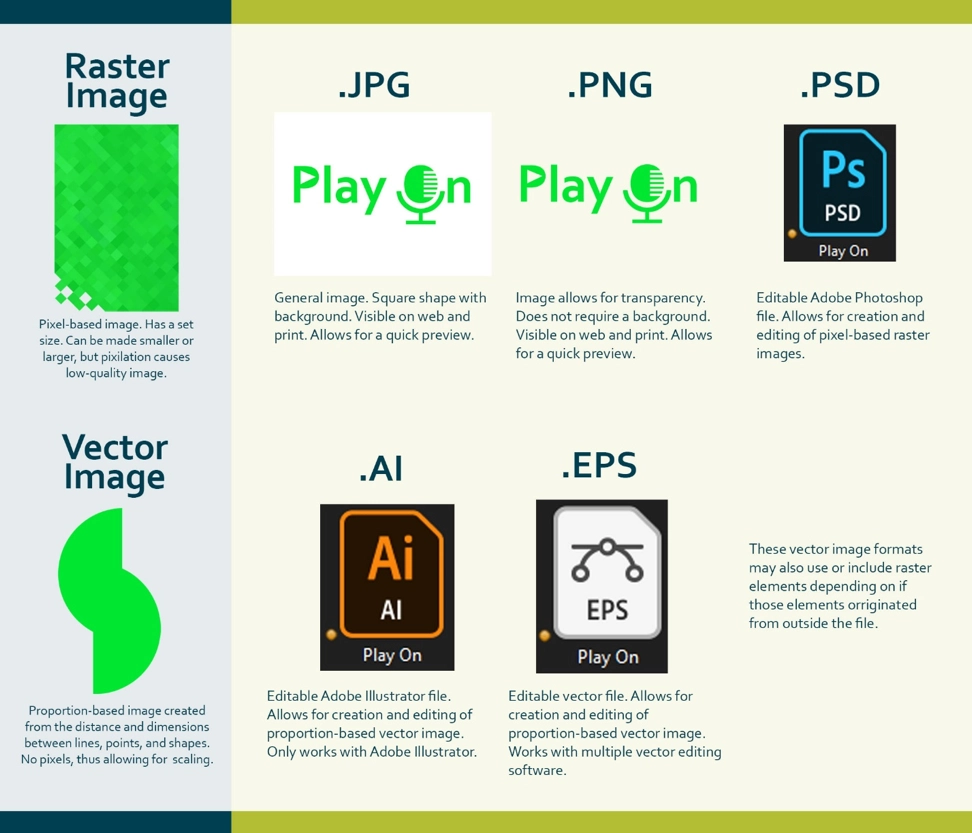
99 Designs has more information on other image file formats including: .GIF, .TIFF, .RAW, and .PDF.
When making a logo, just having a traditional .JPG may work, but ultimately your only image is a square-shaped fuzzy pixel-based picture with no transparency. Creating .JPG and .PNG files from a vector file rather than a raster file allows the company’s updated logo to be more versatile as you grow. A vector allows you to make changes to the file and print it as large or as small as desired. These images are traditionally complex because they require software that provides the ability to create and edit it. Adobe is a popular design software brand, and many designers swear by Adobe Illustrator when working with a vector, but it can include a high price point. Fortunately there are other editors that exist, and MakeTechEasier has an article with the 7 top free graphic editors for creating vector images.
A good logo is crucial for any growing organization. Many individuals find the creative process incredibly overwhelming, but hopefully with these two articles on design, we have been able to simplify it.
As your company starts to expand and grow, Acumen Connections is here to help you with great business advice. When you’re ready to start or expand your marketing journey, you can read our other applicable articles here:
Digital Marketing Tips You Should Know
Controversy in Marketing: A Lesson by Nike
Renee McBride

“A jack of all trades is a master of none, but oftentimes better than a master of one,” is my favorite quote. I’ve been working since high school mostly with small, growing businesses across various industries. I’ve had to wear many hats for each role. In that time, I’ve learned that problem-solving and helping pass on that information to others is what drives me. Today, I’m the Digital Marketing Manager at Acumen Connections.